Deep Dive into Data Visualization
This intermediate-level course is designed to provide a holistic overview of data visualization including the use of charts, dashboards and other visual assets to create intuitive interactive and static data products for varied audiences. The course is also designed with activity components, allowing participants to create varied outputs, ensuring their understanding of the different tools being taught.
-
Duration
30 hours -
Location
Rome, Italy -
Training typology
Onsite -
Certificate
Free of charge


What's included?
-
Hands-on sessions
-
Text materials
-
Certification
-
Peer to peer discussions
Learning Objectives
- Glean insights from the data and present it in an intuitive and digestible format.
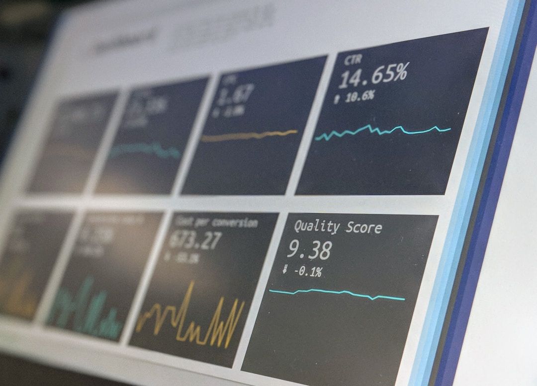
- Use Excel to create static and dynamic charts, including pivot charts and dashboards.
- Identify and create key metrics required for reporting through interactive dashboards using Power BI/Tableau.
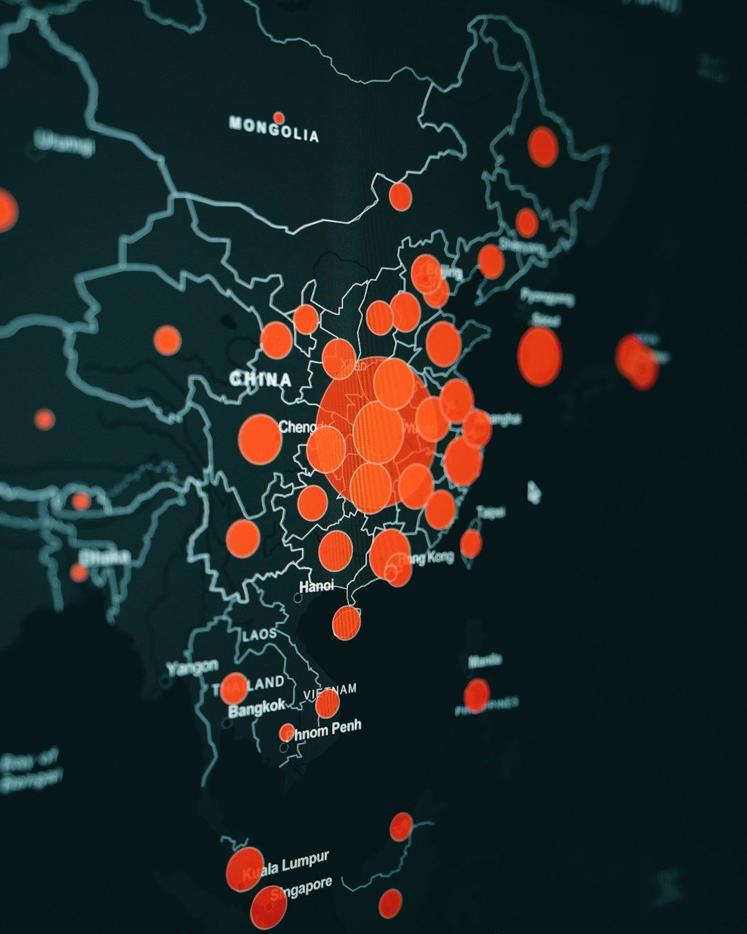
- Develop interactive graphics by using Datawrapper, Flourish, and Visme.
- Understand data visualization best practices when using Stata and R Studio.
Who we are looking for
Data analysts from National Statistical Offices, regional and international organizations, and research and academic communities that seek guidance on data visualization for more effective approaches to disseminating data and evidence.
Meet our core team
Gbemisola Oseni Siwatu
Program Manager for the Living Standards Measurement Study (LSMS)
Amparo Palacio Lopez
Program Manager for the World Bank's Living Standards Measurement Study (LSMS)
Maryam Gul
Consultant, Living Standards Measurement Study (LSMS), World Bank

Elevate your expertise with our latest courses and stay informed with all the news by subscribing to our newsletter. Simply enter your email address below.
By subscribing to this newsletter you agree with the terms of the Privacy Notice and consent to your personal data being processed to the extent necessary to subscribe.
Copyright ©World Bank Group Institute for Economic Development 2024
Copyright ©World Bank Group Institute for Economic Development 2024